Colour psychology in design is real but modest: colour drives 60–90% of snap product judgements, yet the 'red means urgency, blue means trust' folklore oversells what the evidence supports. And microinteractions — the small animated responses to user actions — genuinely shape how products feel, at a performance cost that must be budgeted. The honest guide to both.
What the evidence actually says
- Snap judgements are real: users form impressions in about 50 milliseconds, and colour carries most of that first read
- Context beats universals: the 'red = danger' rule collapses where red is the brand; meaning comes from contrast within the design, not absolute hues
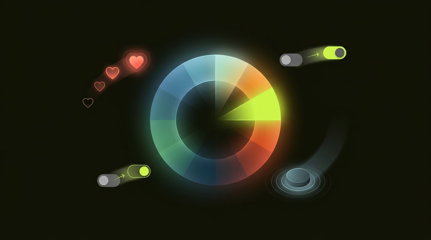
- Arousal is colour's real lever: warm, saturated colours measurably increase arousal and urgency; cool, desaturated tones calm — the mechanism behind every booking-site countdown being red
- Appropriateness matters more than preference: users rate 'appropriate to the brand' as more important than 'favourite colour' — fit beats attraction
- The isolation effect is durable: the one differently-coloured element on a screen gets remembered and clicked — the mechanism behind every effective CTA
Practical colour rules for conversion
- One accent colour, one job: the action colour appears exclusively on interactive elements — dilution kills the isolation effect
- Contrast is non-negotiable: 4.5:1 minimum for text — the accessibility rule that is also the readability rule
- Semantic consistency: green means success everywhere, red means errors everywhere, forever — colour is vocabulary
- Culture checks for global products: white signals purity in the West and mourning in parts of East Asia; verify the palette against the market
The UI discipline applies: colour is UI serving UX — it signals, it does not decorate. The landing page guide shows the isolation effect driving CTAs.
Microinteractions: the feel layer
A microinteraction is the small, purposeful response to a user action — the button that acknowledges the tap, the heart that bursts on like, the toggle that snaps. They serve four purposes:
- Feedback: the system heard you — the loading state, the success check
- Visibility of state: what just changed and what happens next
- Delight: the personality layer — used sparingly, it builds affinity
- Instruction: motion teaches how the interface works
Good versus gratuitous
Good microinteractions answer 'what just happened?' in under 300ms — perceptible, fast, purposeful. Gratuitous ones delay the user, animate without information, or celebrate actions the user did not take. The test: remove it — if the interface becomes confusing, it was doing work; if it merely becomes less cute, it was decoration. And they compound: fifty 'small' animations on a page are a performance problem wearing a design badge — the speed guide covers the budget they must fit.
The discipline that binds them
Colour and motion are the product's tone of voice — the same message spoken consistently builds trust; spoken erratically, it reads as instability. Our design services codify both into design systems so products stay consistent by construction — book a consultation with the product, not the palette swatches.
Frequently asked questions.
Is color psychology real?
Partly: colour drives 60–90% of snap product judgements and warm saturated colours measurably increase arousal — that much is evidence. The universal 'red means urgency, blue means trust' folklore oversells it: context, contrast within the design, and brand appropriateness matter more than absolute hue meanings.
What is the isolation effect in design?
The one differently-coloured element on a screen gets noticed, remembered and clicked — a durable cognitive bias. It is the mechanism behind every effective CTA: one accent colour reserved exclusively for actions, diluted nowhere, so the action button is always the odd one out.
What are microinteractions?
Small, purposeful animated responses to user actions — the button acknowledging the tap, the toggle snapping, the success check appearing. They serve feedback, state visibility, instruction and measured delight. Good ones answer 'what just happened' in under 300ms; gratuitous ones delay users without informing them.
Do animations hurt website performance?
Individually no; cumulatively often — fifty 'small' animations compound into real load and interaction cost. Budget them: perceptible under 300ms, purposeful (the removal test: confusing without it = working; less cute without it = decoration), and measured against Core Web Vitals.
How should color be used for conversion?
One accent colour reserved exclusively for interactive elements (the isolation effect), 4.5:1 text contrast minimum, semantic consistency (green success, red errors, everywhere, forever), and cultural verification for global markets. Colour signals; it does not decorate.
Enjoyed this? Let's talk about applying it to your product.