Most dashboards fail the same way: cramming every metric onto one screen and calling it a control centre. The professional approach inverts it — start from the decisions the user makes, then surface only the data those decisions need. Well-designed dashboards answer questions in under five seconds; badly designed ones become the tab nobody opens.
The decision-first principle
Before any chart is drawn, answer: who uses this dashboard, and what decision do they make while looking at it? An ops lead deciding staffing needs the queue depth trend, not the marketing funnel. A CEO needs exceptions and trajectory, not operational detail. One dashboard per audience, per decision family — the discipline that separates tools from wallpaper.
Layout patterns that work
- The F-pattern scan: most important metrics top-left, descending in importance along natural eye movement — the pattern users actually read, not the grid that fills evenly
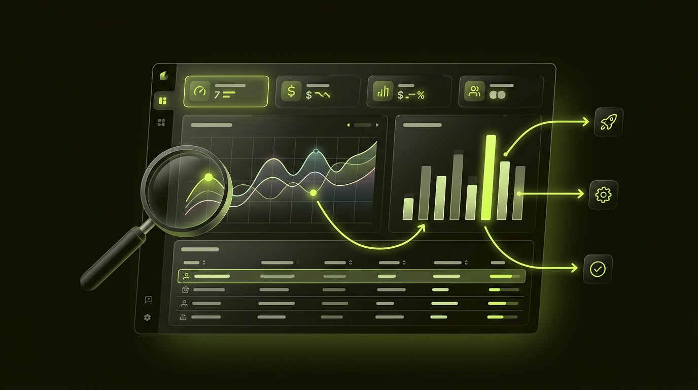
- The KPI row: 3–5 headline numbers across the top, each with context (target, trend, comparison) — never naked numbers
- Progressive disclosure: summary level first, drill-down on interaction — the detail exists, on demand, not by default
- Five-second hierarchy: the user should grasp the state of the business before reading anything — colour, size and position carry the first read
Data visualisation rules
- The right chart for the question: trends over time = lines; comparison = bars; part-to-whole rarely needs the pie everyone reaches for; correlation = scatter
- Bars start at zero — truncated axes manufacture drama and mislead decisions
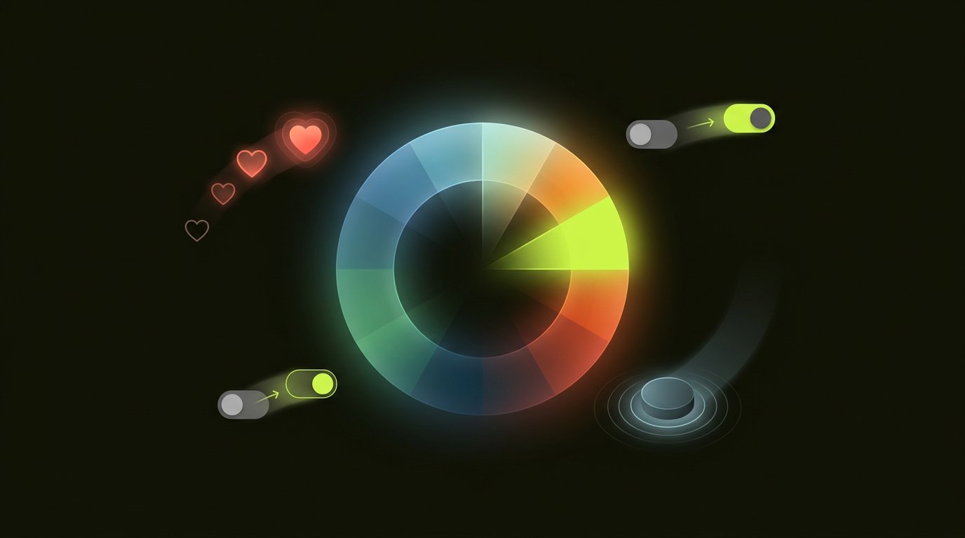
- Colour as data, not decoration: semantic consistency (green good, red bad) across every chart; the palette is vocabulary, not decoration — the colour and interaction guide covers the discipline
- Label directly on the line or bar where possible; legends force the lookup that breaks flow
- Design the empty, loading and error states — dashboards live in these states more than anyone plans
The mistakes, ranked by frequency
- The everything-dashboard: one screen serving five audiences serves none
- Vanity metrics at scale: impressions and totals instead of rates, trends and exceptions
- No time context: a number without comparison (yesterday, target, last quarter) is a trivia answer, not an insight
- Chart-type theatre: gauges, 3D pies and radial monstrosities that look impressive and read poorly
- No path to action: the dashboard shows the problem and stops; the ops user still needs four clicks to fix anything
Enterprise and B2B specifics
Enterprise dashboards carry additional rules: dense tables for power users (filters, sorting, saved views — see our B2B SaaS design practice), audit trails on exports, and performance engineering for the million-row table nobody mentions in kickoff. Our design team builds dashboards decision-first — the design cost guide covers the engagement economics. Book a consultation with the decisions your dashboard should serve.
Frequently asked questions.
What makes a good dashboard design?
Decision-first design: start from who uses the dashboard and what decision they make, then surface only the data that decision needs. Strong dashboards use an F-pattern layout, 3–5 contextualised KPIs, progressive disclosure and a five-second hierarchy that communicates state before anything is read.
How do you design a dashboard from scratch?
Interview the users about their decisions, define one dashboard per audience and decision family, sketch the five-second first read, choose charts that answer the actual questions, design empty and error states, and test with real users performing real analysis tasks.
What are the most common dashboard mistakes?
The everything-dashboard serving five audiences, vanity metrics without context, numbers missing comparisons, decorative chart types (gauges, 3D pies) that read poorly, and dashboards that surface problems without any path to action.
How many KPIs should a dashboard show?
Three to five headline KPIs with context (target, trend, comparison) on the top row, with everything else available through drill-down. More than five competing headline numbers means either multiple audiences crammed into one dashboard or unmade decisions about what matters.
What chart types work best in dashboards?
Lines for trends over time, bars for comparisons (always starting at zero), scatter plots for correlation, and direct labelling over legends. Pies and gauges are usually decoration — part-to-whole works better as stacked bars, and single-value KPIs with trend context beat dials.
Enjoyed this? Let's talk about applying it to your product.