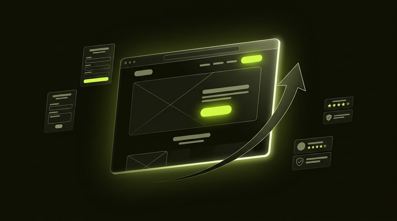
A high-converting landing page does one thing: continues the conversation the visitor arrived having. The best-performing pages we build convert at 5–15% where generic pages convert at 1–2%, and the difference is rarely aesthetics — it is message match, single-goal focus, proof placed at the moment of doubt, and speed. These are the twelve rules that get there.
The only metric that matters first
Before any design decision: define the one action this page exists for — a signup, a demo, a purchase. Every element either moves the visitor toward that action or it leaks them away. Pages with two equal goals convert worse than either goal alone; the moment you let a second call-to-action in, you are running an experiment against yourself.
The 12 rules
1. Message match beats creativity
The headline must continue the ad, email or search result that brought the visitor. If they clicked an ad about inventory software, the page opens with inventory language — not your brand slogan. Mismatch is the number-one conversion killer because it feels, to the visitor, like walking through the wrong door.
2. One page, one goal, one CTA
One primary action, repeated. The nav bar, the footer links and the blog sidebar are all exits — the best landing pages quietly remove them. Every additional link costs conversions; distraction is the tax on unfocused pages.
3. Value above the fold, in five seconds
A stranger should understand what this is, who it is for and why it matters within five seconds. The formula that keeps working: headline (what you get) + subheadline (for whom and how) + one CTA + proof strip. If the value needs a paragraph, the page has a positioning problem, not a design problem.
4. Write for scanners, then readers
Eight of ten visitors scan before they read anything. Structure for both: headline, scannable subheads, short paragraphs, bullets with bolded lead-ins. The reading depth data is brutal — most visitors never see your third paragraph. Put the value in the scan path.
5. Proof at the moment of doubt
Testimonials, logos and numbers work — placed where doubt appears, not in a wall at the bottom. Next to the CTA: a short customer quote. Near pricing: a case number. Wherever the visitor hesitates, that is where proof belongs. Vague praise underperforms specific numbers from real, named customers every time.
6. Forms: ask less, get more
Every form field costs completions — typically 5–10% each. Ask for what you need to respond well, nothing more. Names can wait for the reply email; company size can be inferred. The highest-converting B2B forms in our work ask for exactly three things.
7. Speed is a design feature
Every additional second of load time measurably cuts conversions. Sub-2-second loads need engineered discipline: compressed hero media, deferred scripts, no carousel of uncompressed product shots. A beautiful page that loads in four seconds loses to a good page that loads in one — see our ecommerce CRO that works piece for the same principle in stores.
8. Mobile is the primary experience
Design mobile-first, then expand to desktop — most traffic now arrives on phones, and thumb-reach rules apply: primary CTA within the natural scroll path, forms single-column, inputs with the right keyboards. A landing page that merely shrinks its desktop layout is converting against itself.
9. Images that work for the message
Product-in-context beats stock optimism. A real screenshot with a thoughtful annotation outperforms a stock photo of high-fives, every time. If the product is abstract, one clear diagram beats three decorative photos.
10. Contrast and hierarchy do the pointing
One visually dominant element per viewport — the CTA. Colour, size and whitespace are the pointing devices; when everything is emphasised, nothing is. The acid test: squint at the page; if the CTA is not the first thing your eye finds, the hierarchy is broken.
11. Answer objections in order
List the top reasons a visitor does not convert — price, trust, timing, effort — and address them in the order a rational buyer would raise them. An FAQ section placed before the final CTA consistently lifts conversion because it clears exactly the doubts that stall decisions.
12. Test one thing at a time
A/B testing works when it is disciplined: one variable, adequate sample, a stated hypothesis, and the patience not to peek at day two. Sequential micro-tests on a small-traffic page are theatre. When traffic is thin, ship the version that follows these twelve rules and spend your statistics budget on the traffic itself.
The 60-second landing page audit
- Can a stranger state what you offer in five seconds?
- Is there exactly one primary action, visually dominant?
- Does the headline match the traffic source?
- Is specific proof placed next to the CTA?
- Does the form have the fewest fields possible?
- Does it load in under two seconds on a phone?
Any no is a conversion leak with a known fix.
What about tools and templates?
Builders like Webflow, Framer and Unbounce can host perfectly good landing pages; the rules above apply identically. Templates fail when they skip rule one — message match is not a layout feature, it is a writing discipline. If the page carries ad spend, custom landing page design services with a conversion brief pay for themselves in media efficiency — and if the traffic strategy is the question, our digital marketing experts build the funnel around it.
Before you launch
Pre-launch, run the page past five people who match the target audience and ask them what the page is selling and for whom. If their answers disagree, fix the message — the design cannot rescue it. Then book a conversion review if you want a senior pair of eyes on it; we read landing pages the way accountants read balance sheets.
Frequently asked questions.
What makes a good landing page?
One goal, message match with the traffic source, a five-second value proposition, proof placed at moments of doubt, a minimal form, and sub-two-second load times. Pages following these principles typically convert at 5–15% versus 1–2% for generic pages.
How long should a landing page be?
Long enough to answer every reasonable objection, short enough to stay interesting — typically 3–6 mobile viewport heights for consideration purchases, and single-screen for simple signups. Depth should match the commitment level: the more you ask of the visitor, the more proof the page must carry.
What is a good landing page conversion rate?
Across industries, 2–5% is average, 5–8% is strong, and above 10% is excellent. The biggest variable is traffic quality — a perfectly designed page with cold traffic can convert below 1% while the same page with warm referral traffic exceeds 15%. Judge pages against your own history, not global averages.
Should landing pages have navigation?
As a rule, no. Navigation links are exits that compete with the single conversion goal. Exceptions exist for pages inside a sales sequence or for compliance reasons, but a page carrying paid traffic almost always performs better without a nav bar.
How many CTAs should a landing page have?
One primary action, repeated in multiple places. Multiple CTAs to the same action are good — they catch visitors at different scroll depths. Multiple different CTAs split focus and reliably reduce conversion on the primary goal.
Enjoyed this? Let's talk about applying it to your product.